
Announcing Our NEW Brand Identity and Website!
Posted by -Jennifer Carter on May 15th 2018
Big news!
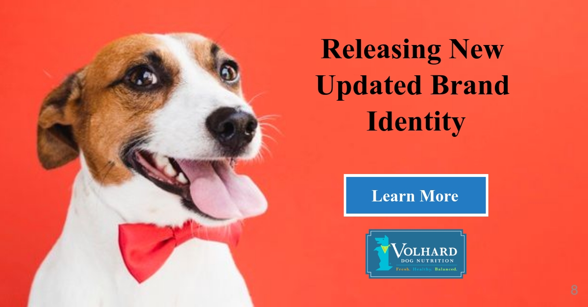
Today, after thirty years, Volhard Dog Nutrition (VDN) is releasing an updated brand identity, which includes a new logo, colors, and font. You’ll see the new look anywhere we’re out in public, like our website, Facebook, and Twitter. Very soon you’ll see it on all of our products, as well. We believe the new look better matches what we’ve become since the early eighties: a provider of fresh, healthy, and balanced dog nutrition. Volhard Dog Nutrition is displacing the pet food industry with its unique offering of a dehydrated balanced foundation mix to which you can add your pet’s favorite meat. It could not be more fun or more fresh!
Since our founding in 1984, we’ve more or less stuck with the same unique Volhard dog and holistic vet symbol in a round logo. With the change in ownership this past January we took a close look at the brand overall and decided that a refresh was in order. The Volhard dog and vet symbol felt a bit prescriptive, like a type of food offered by veterinarians only and the royal blue and white did not come across like the “farm to face” message we wanted to share. Needless to say, it was time for a change.
We have grown and evolved over the years, and we have refreshed our look to reflect who we are today and to symbolize our future. Our design goal was to better match how we look to our Core values (https://www.volharddognutrition.com/mission-vision-and-core-values/) and the dogs we serve. A small team inside the company worked to find something that appeared fun, approachable, smart, friendly, and connected to all generations without losing the history of the Volhard dog and mission. We are proud of our rich history and deep roots so we have retained the original logo’s core element: the Volhard Dog.
Compared with royal blue, the lighter teal blue is cool and refreshing, and the darker, slate-blue feels a bit scientific. The colors in the tagline Fresh. Healthy. Balanced. are orange and lime green to represent the fresh, whole vegetables we put in our food while the blue represents the water we add to rehydrate the nutrients. The Baskerville font is deliberately clean, modern, and light. Our Volhard dog got a refresh that put an eye and mouth on a smiling face which is eager to eat, wearing a bandana with the respective Volhard “V” on it!
Along with announcing our new brand identity, we have launched our new website featuring a modern, clean design. The new site delivers rich content in a more visual and organized way to provide visitors easy access to learn about our Dog Nutritional products. Our new website employs what is called a “responsive design” that dynamically resizes to fit the user’s browser. This means that no matter what device you are using, the site will adjust to provide you with a pleasurable viewing experience.
The new website and brand identity reflect the bold, energetic and forward-looking culture of Volhard Dog Nutrition and are designed to inspire and further elevate us as we continue to provide quality value to our customers.We hope you like this new look and feel for Volhard Dog Nutrition! Look out for more updates- like an updated look in our product labels and other marketing literature as we continue to try to better serve our customers with clean, modern, user-friendly technology.